Bruno Moinard Éditions
2012
•
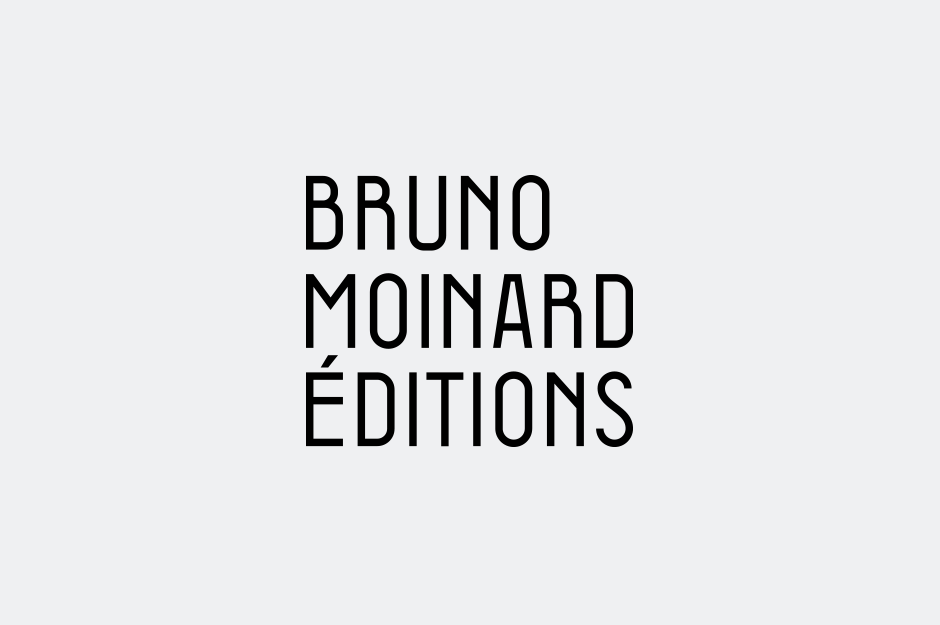
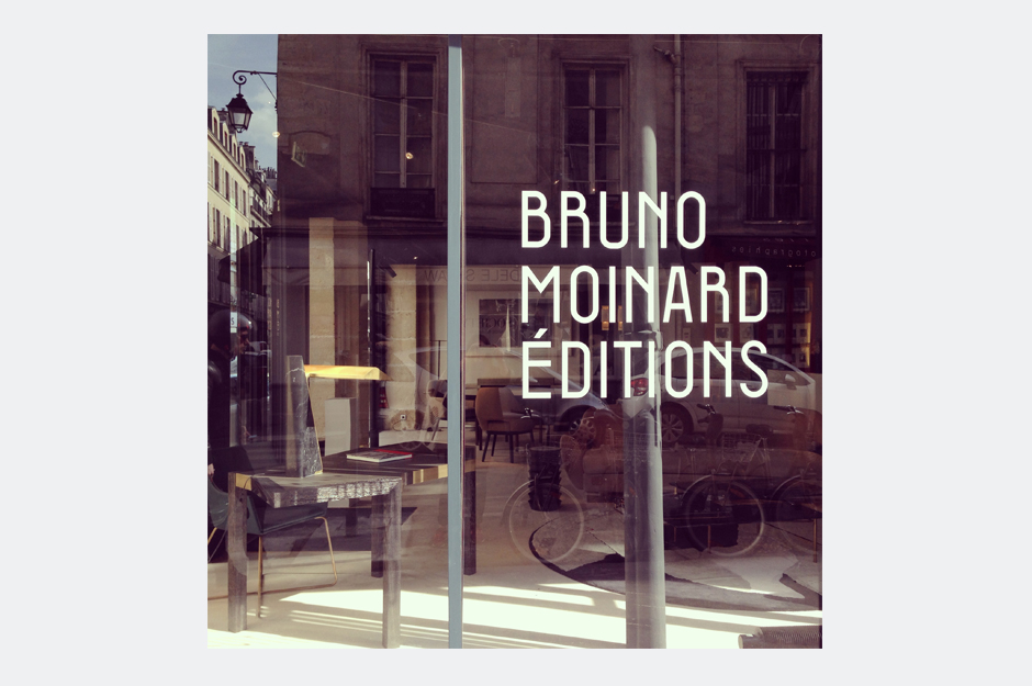
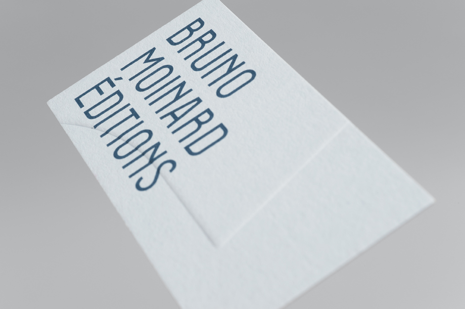
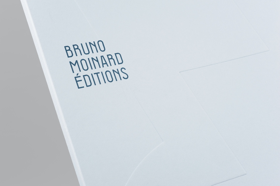
Identité visuelle de Bruno Moinard Éditions, ligne d'édition de mobilier de l'architecte d'intérieur Bruno Moinard. Conception d'une police de caractère spécifique, d'inspiration art-déco, donnant ainsi à l'identité son caractère unique.
Lors du salon AD Intérieurs 2013, du 7 et 22 septembre 2013 à l’Enclos des Bernardins, Bruno Moinard invite Bornstein & Sponchiado à illustrer le mythe de Daphné et d’Apollon et plus précisément la métamorphose de celle-ci en laurier. Il imagine voir un motif se déployer sur des tôles de laiton ciselées transformant ainsi le paravent en jeu d’ombres et de lumières. Bornstein & Sponchiado laisse libre-court à leur imagination et s’approprient cette légende en symbolisant Daphné par sa chevelure fougueuse, donnant ainsi un accent de modernité à ce mythe antique. Les cheveux de la nymphe, comme ensorcelés, se mêlent aux branchages, se transforment, et laissent apparaître progressivement le laurier-rose. Le paravent Helvetes, issu de ce travail, est édité par Bruno Moinard Éditions.
•
typographie originale | logotype | charte graphique | carte de visite | carte de correspondance | papeterie | AD intérieurs 2013 | paravent | illustrations | motifs floraux
Bruno Moinard Éditions
2012
•
Visual identity of the new furniture design collection of the interior architect, Bruno Moinard.
Designed of a specific typeface, in the art-deco style, giving the identity his own singularity.
During AD Intérieurs 2013, from the 7th to the 22nd september 2013 at the Enclos des Bernardins, Bruno Moinard commissioned Bornstein & Sponchiado to illustrate the myth of Daphne & Apollo and Daphne’s metamorphosis into a laurel tree. Moinard’s vision was of patterns cut into a brass panel, creating a subtle play between shadows and light. Bornstein & Sponchiado delved into the theme and maked this story their own, modernizing the ancient myth by referencing Daphne’s wild hair. The nymph’s hair seems bewitched intertwining with branches, transforming itself and eventually becoming a rose laurel. The "Helvetes" folding screen, created from the work of Bornstein & Sponchiado is edited by Bruno Moinard Editions.
•
original typeface | logotype | corporate identity | guideline | business card | compliment slip | stationery | AD intérieurs 2013 | folding screen | illustrations